
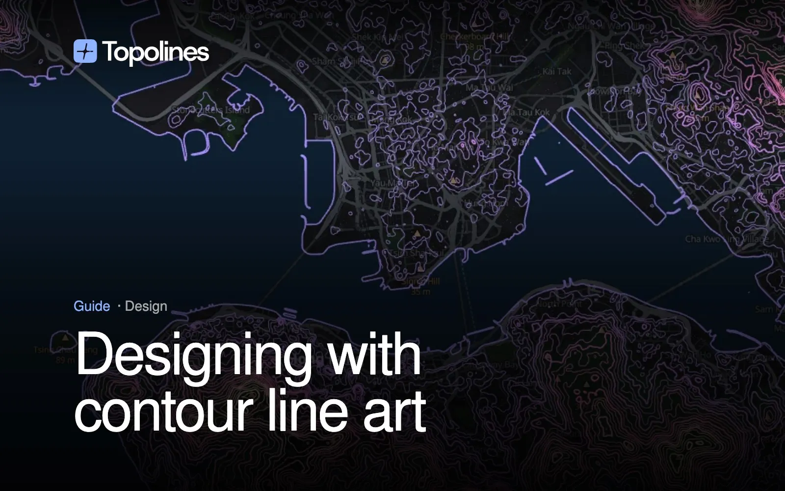
Contour lines are a strange design material: the pattern is already drawn, by the ground. You don’t invent the shapes, you choose them — which place, how dense, how heavy, which colours. Those four choices decide whether a contour piece reads as intentional or as a screenshot of a hiking map. This is how I approach each of them in TopoLines.
1. Choose terrain with a shape
The place matters more than any setting. Terrain that reads well as a pattern usually has one strong structure the eye can follow:
- A massif — concentric rings around peaks, the classic topo look. Chamonix gives tight, nervous lines on the north side of Mont Blanc and open ones down the valley.
- A coastline against steep land — Amalfi, Rio de Janeiro, Hong Kong, Wellington. The sea is a calm empty field and the lines pile up right at the edge, which gives a composition its figure and ground for free.
- A fjord or a canyon — Geiranger: long parallel walls of lines around a single empty cut.
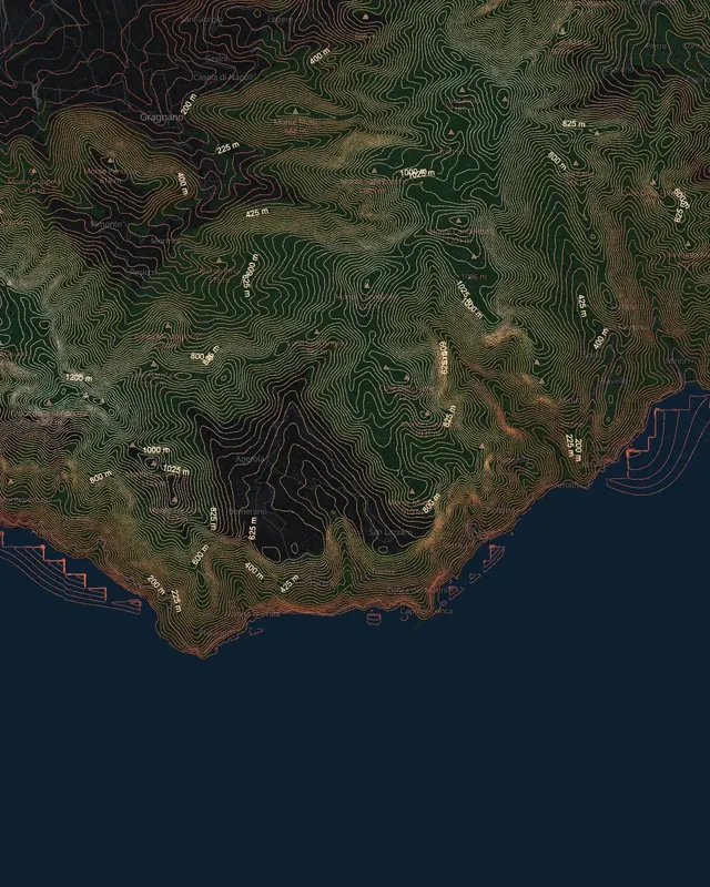
Flat land is the hard case: few lines, wandering far apart. It can work as a minimal piece, but it’s usually where relative mode helps (see below).
Frame tightly. A smaller zone around the one feature you care about almost always beats a wide view where everything gets the same weight.
2. Set the interval for density, not accuracy
The interval — the height between two lines — is the single setting that changes the result most.
- Tight (5–10 m): dense, textured, almost a fabric. Good for large prints viewed up close, and for gentle terrain that would look empty otherwise.
- Medium (20–50 m): the readable middle; the shapes of ridges and valleys come through clearly.
- Wide (100 m+) on big relief: few, calm lines — the poster you hang across a room.
Steep terrain plus a tight interval merges into solid ink, so go wider as the relief gets steeper. If you’re making a series across very different places, relative mode keeps the line count roughly constant from coast to mountain, so the prints feel like one family.
3. Line weight carries the hierarchy
With every line at the same weight, the map is flat. Three ways to give it structure:
- Index contours: every fifth (or n-th) line heavier, like on survey maps (how index contours work). Instantly gives a rhythm and makes the relief legible from a distance.
- Taper: lines get thinner as they climb, so valleys read heavy and summits read light — closer to a hand-inked drawing.
- Plain thin lines on a dense interval, if the texture itself is the point.
Keep in mind the output size. A line that looks right on screen at 1 px can vanish at 70 cm, and a heavy line on a tight interval clogs fast. For print, export a vector and set the final weight in your layout tool.
4. Colour by height, or don’t
A single colour on a contrasting background is the safe start: white on deep blue, dark grey on off-white, one brand colour on its pair.
An elevation gradient colours each line by its height, which adds a reading of depth without any shading. Two tips:
- Few stops. Two or three colours read as a design; seven read as a weather map. The Imhof-style presets are the exception — they work because the palette is a convention people already know.
- Reverse to change the focus. Putting the bright end on the valleys instead of the peaks pulls the eye to the water, which suits coastlines.
5. Export in the format the job needs
- SVG for anything printed large, laser-cut or edited further. Lines are grouped by elevation, so one height band can be recoloured or removed in Figma or Illustrator. See contour map SVG and laser cutting.
- HD PNG for screens, social posts and mock-ups.
- Copy to clipboard to paste straight into Figma; there’s also a Figma workflow guide.
Where it works
- Posters and prints of a place that matters to someone — a summit, a home coast.
- Album covers and editorial spreads, where a real place adds meaning a generic texture doesn’t.
- Brand patterns built from the terrain around a company’s city.
- Event stationery: wedding invitations, race bibs, festival maps.
Each of these is the same process: pick the shape, set the density, give the lines a hierarchy, keep the palette short.